30
May
2012
Speaking of Drawing Boards
By the illustrator, Lisa Mertins
Well, a computerized drawing board, anyway…
I knew it would be easy to fix any changes with my final paintings in Photoshop but I didn’t anticipate that the first piece I finished so it could sent to Mill Press would be the one that would need extensive correction. When I found out there was a revision for the cover, I was really thankful for good ol’ Photoshop!
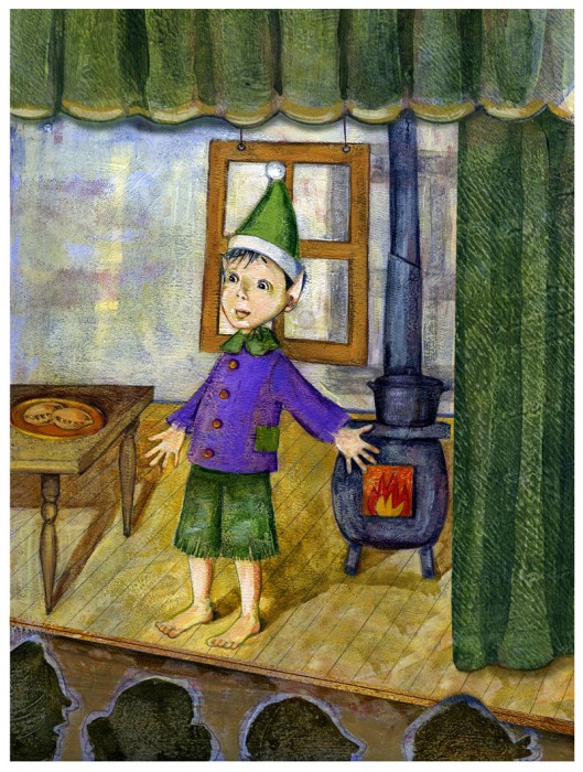
With the change of title, there was consensus we should show more of a stage scene compared to my original cover art. Now that I’ve made the fixes, I agree that it helps compliment it.
In the past when I was painting, I wasn’t proficient in Photoshop. I eventually created almost all my art with it. I just adore how easy it is to make corrections with scanned paintings. Now, I know it’s easier for me to paint and make corrections than it is to create original Photoshop art!
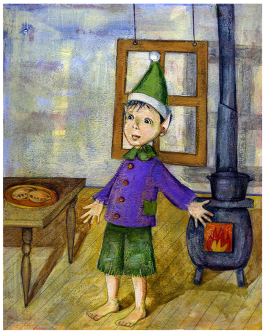
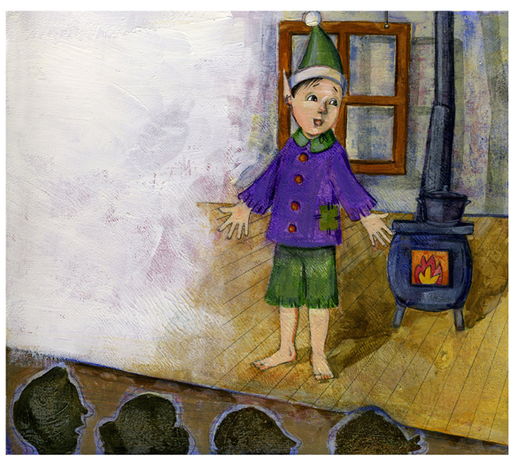
Here are the two paintings I used to give Jimmy more stage:
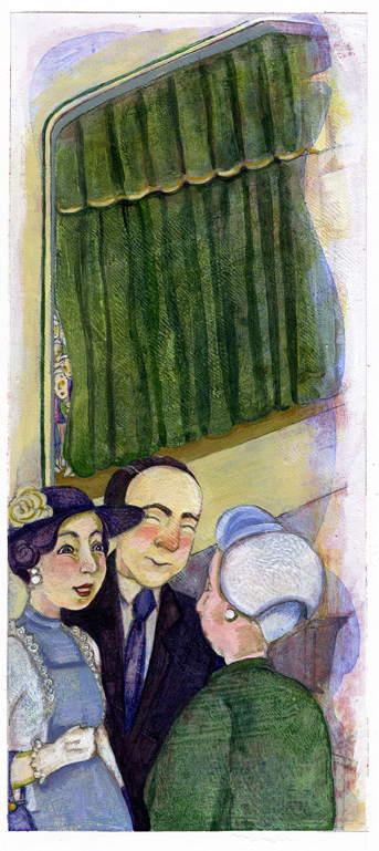
Can you tell it’s cut and pasted on the new cover? And can you pick out the details from pages 25 and 26 that I added?


