Interior Formatting
By the author, Jim Doti
Lisa and I worked very closely with my associate, Ann Cameron, who combined the text with the illustrations and created a fully assembled book. While this is work that typically would be done by Mill City Press, it gave Lisa and me the opportunity to see how everything fit together and enabled us to see additional revisions and edits we needed to make. By making these changes now, rather than later, we saved time we would have lost had it been necessary for Mill City to make corrections to their formatted interior. Given our goal to get delivery of the books for the holiday season, every day counts.
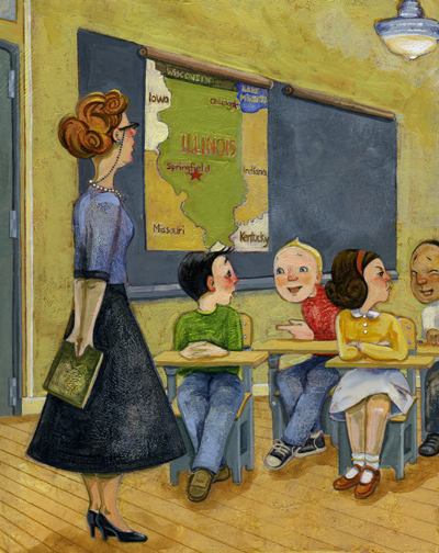
One of the more significant changes involved a continuity error that had somehow escaped our notice until now. Lisa’s first illustration of Mrs. Lyons and the students in the classroom includes a blackboard with two roll-down panels attached at the top. The panel at the left, showing a map of the State of Illinois, is rolled down over the blackboard.
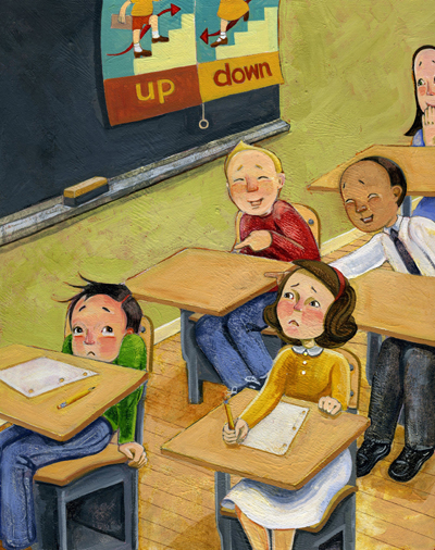
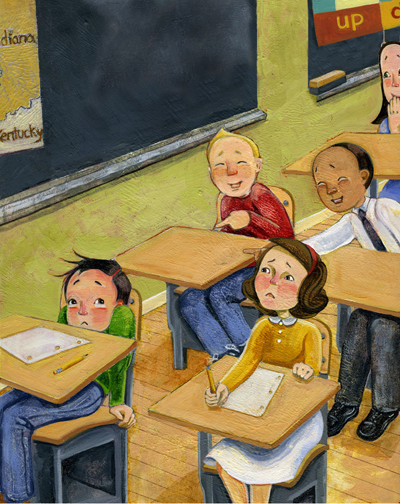
Over the next several pages, Lisa illustrates “The Elves and the Shoemaker” as Mrs. Lyons reads the story to the class. As she finishes reading, the scene returns to the classroom. But the map is now rolled up and the panel to its right, demonstrating “Up” and “Down,” is rolled down. This makes no sense, since nothing transpired in the classroom other than the telling of the story.
One simple option, of course, would be to remove the “Up-Down” panel in the second illustration. But I loved it, and so did Lisa.
So she came up with a different solution: She removed the “Up-Down” panel and included a small portion of the map of Illinois. Then she added a second blackboard, where a small part of the “Up-Down” panel appears.
All of this may sound like overkill. I have found, though, that children have very strong powers of observation, and some would be likely to catch this error in continuity. Our fix here is a sign of respect for our young readers.
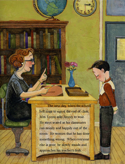
Another change involved an illustration where Mrs. Lyons is seated at her desk while talking with Jimmy. To fit all the text I had written, Ann had to place one paragraph over the side of the desk.
Squeezing the text within an illustration is something that troubled Ann and me ever since she initially laid out the copy. But now that we were coming down to the fine points, Ann noticed that with some judicious cutting, we could free up enough space to remove the text from the side of the desk. Since getting rid of extraneous words tightens up the narrative text, I wasn’t surprised that the edited page not only looked better but read better as well.
Finally, Lisa and I came up with our dedications. Both of us thought it best to tie these dedications to the theme of the book.
Dedicated with respect and gratitude to Mrs. Lyons
and all the teachers who helped me find my voice.
J.D.
To the children that talk, walk, think or do things differently,
I was once where you are now. The best part is, I still am!
L.M.
After a few other minor changes, we sent the final version to Mill City for “Interior Formatting.”


