New Website Template Masthead Options and Menu!
Announced on October 7, 2014
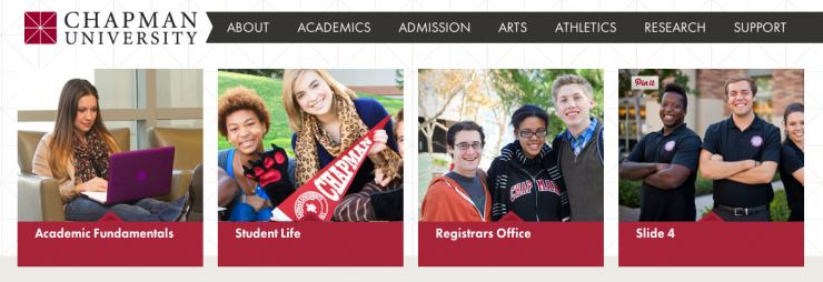
In a effort to continually improve upon the Chapman website’s function and design, we are introducing three new masthead options for your use on all templates (excluding the department template). These options include a branded masthead, a four box rotator and a larger image slider. Below is a quick rundown of each new option and a look at the new menus in the edit mode of the Cascade content management system.
The main reason for the upgrade was to align the width of the mastheads to the width of the new page designs, which were introduced last year. We have also taken the opportunity to build in a few new features that will help brand your section better.
Cascade CMS Masthead Menu
Let’s begin by making you aware of a related CMS display setting change. Upon entering the edit mode of a page in the Cascade CMS, you will now notice that all the insertion areas (masthead, main content, left sidebar, etc.) are closed, or collapsed, by default. This was a minor visual change we made that will help you navigate easily to the different template sections.
That being said, the first of those sections, and the topic of this post, is the Masthead Options:
Included in these options are the three new mastheads, the “no masthead” option, and a “use old masthead” option. We have included the “use old masthead” option as a way of transitioning from the older masthead banner settings to the new. Your pages will default to this setting at first, but we urge you migrate to the new mastheads options explained below.
Boxes (rotator)
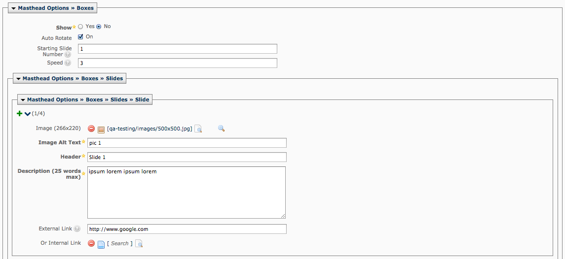
Similar to the current three box slideshow masthead, this new option simply extends the visual boxes to four, filling the full width of the page. There still exists the options to autorotate, have additional text on the hover and link to other pages. This header is great for departments that have many services or programs that needs to be highlighted on a more landing page scenario.
CMS Menu:
When using this masthead, you must at least fill in four boxes to appear full visually. Beyond that, you can create as many as desired, but we recommend no more than seven total. Please note the slight change in image dimensions to 266 x 220 px.
Branded Masthead
One of the most notible changes is the inclusion of a branded masthead. By branded we mean that departments will now be able to label their school or departments on the banner masthead itself, unlike before where you were limited to just have an image. We recommend using this throughout your section to create a consistent experience for your users.
Without subtitle:
With Subtitle:
CMS Menu:
This simple menu allows for title, subtitle and image. Please note the image dimensions are 1130 x 220 px.
Slider
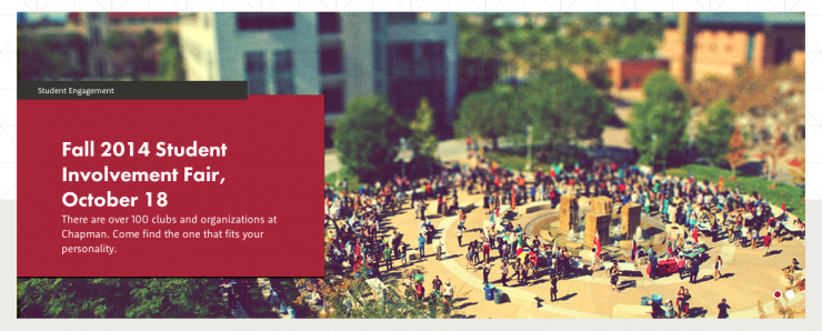
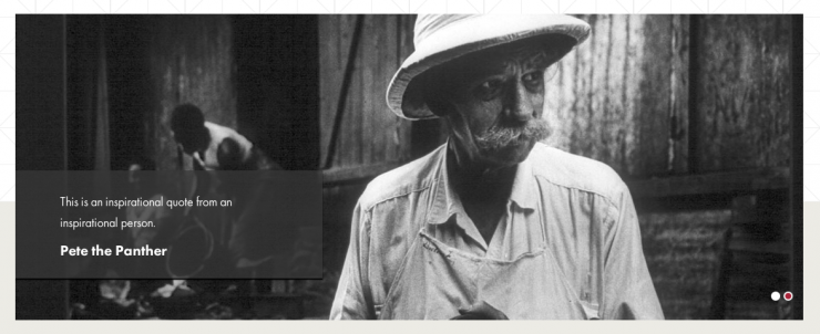
The last of the masthead options is a more visual slide rotator. This slider can be used for event and story promotions, a larger branded masthead or simply as an image rotator. We recommend only using this option on landing pages and using the branded masthead for subpages to your section.
Red solid background with title, subtitle and description:
Black opacity background with description and attribution:
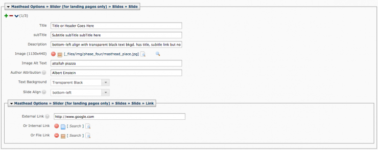
CMS Menu:
As you see below, there are a few more options available with this masthead. You have the options for red or black opacity backgrounds, subtitle inclusion/exclusion, linking to other pages, etc. These settings are available to give you more options when creating multiple slide. Maybe you want an event promotion slide followed by a inspirational quote. We recommend no more than 5 slides, but have fun. Please note the image dimensions are now 1130 x 440 px.
Thanks for reading. We will be pushing these changes live soon. If you have any further questions, please contact your Web Coordinator.

