7 Simple Steps for Creating Accessible Course Materials
November 15, 2024
Accessibility has been a hot topic in higher education this year in light of updated regulations for Title II of the Americans with Disabilities Act (ADA). Community colleges and public universities are required to be in compliance with these regulations, ensuring that web content and mobile applications are accessible to people with disabilities.
Creating accessible course materials and other digital content may feel overwhelming, but with these 7 simple steps from Indiana University, instructors and content creators can reduce barriers and foster an inclusive environment.
1. Headings
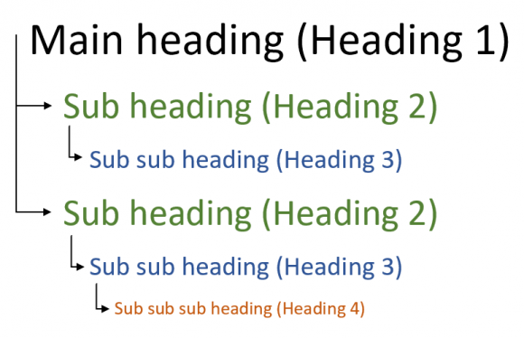
Structure documents and web pages using built-in headings based on the organizational hierarchy of the document.
Headings are essential for organizing a web page or document, helping readers understand its structure and content. They provide a clear outline of topics and subtopics, making it easier for readers to follow and comprehend the material. Headings also serve as a navigation tool for both visual readers and those using screen readers, allowing them to quickly locate specific sections.
2. Images
Describe the purpose or content conveyed by an image using alternative text, imagining what text you would have used if not using the image.
Have you ever seen a red indicator “dial” near an image in a Canvas course? This most likely means that the image does not have a description. You can click on the red indicator “dial” to add alternative text.
These colored indicator “dials” in Canvas come from a tool called Ally. Ally…
- checks uploaded files (not just images) for accessibility.
- provides instructions for improving the accessibility of files.
- generates accessible alternative file formats.
Ally can also help you make scanned PDFs accessible.
3. Links
Use link text that describes the link’s destination or function.
Below are examples of non-descriptive links.
Below is an example of a descriptive link.
4. Color
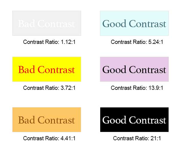
Use text colors that strongly contrast with the background.
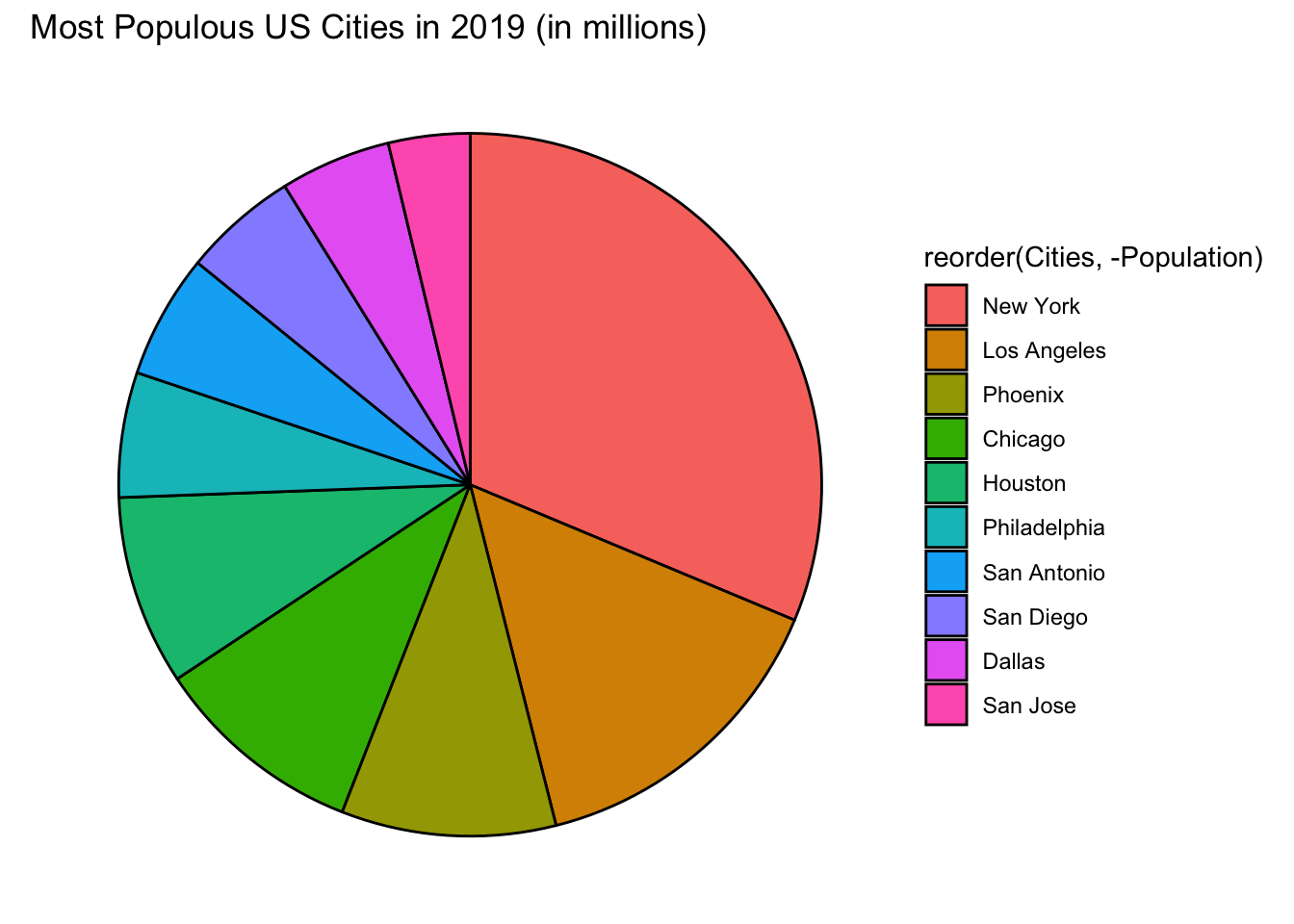
Don’t use color as the only way to identify something.
When providing instructions, instead of “Click on the green button,” use, “Click on the green Start button.”
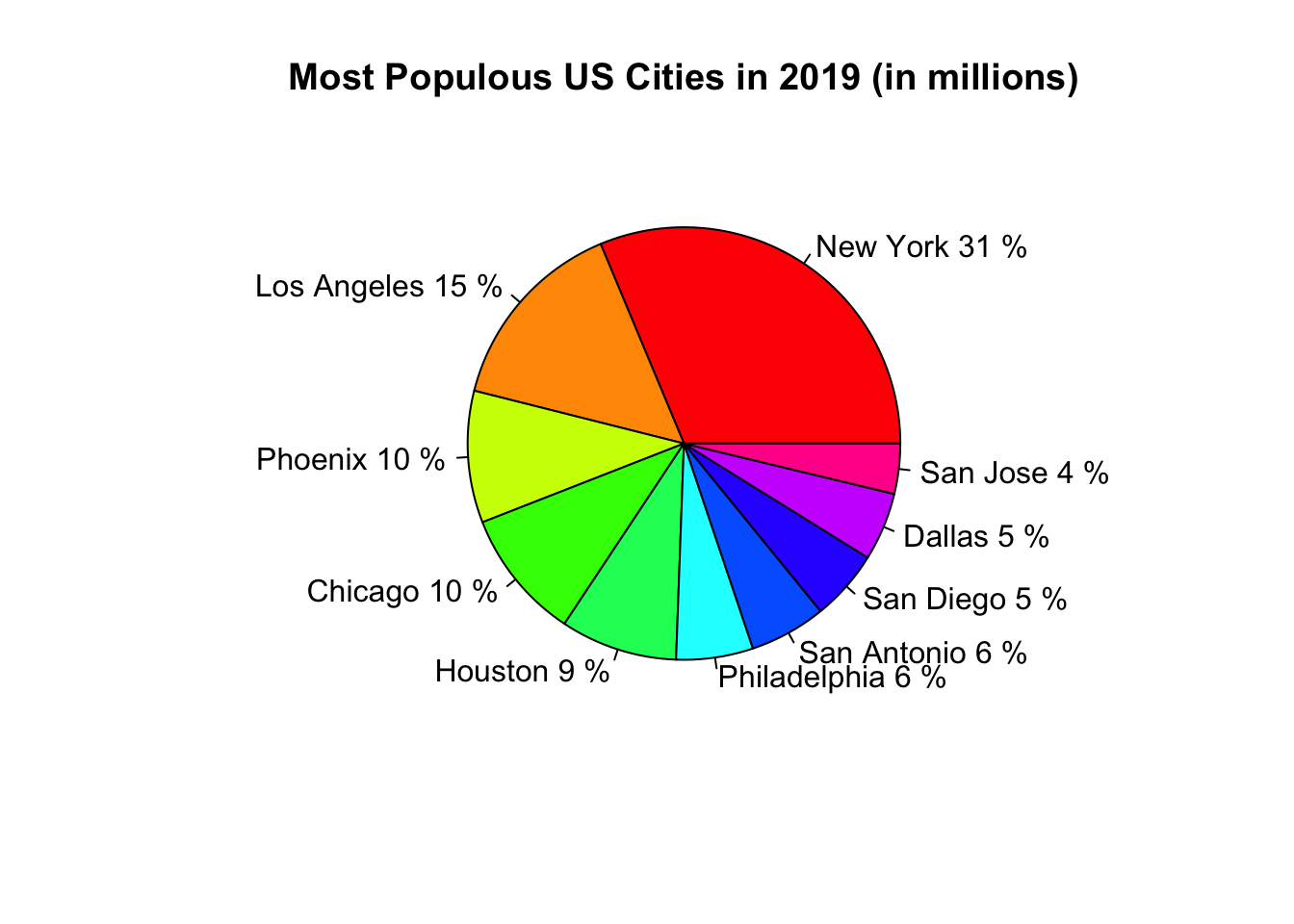
When sharing data, look for charts with labels rather than charts that use color as the only way to identify the data points.
5. Lists
Format numbered or bulleted lists using the built-in list buttons.
Numbered and bulleted lists help users of assistive technology to navigate and understand the items on the list. A screen reader can identify a list and tell someone how many items are on the list by vocalizing the information, for example, “List of four items. Bullet 2.”
- Use the software’s built-in list function. Do not manually create lists.
- Use a bulleted list to group together related items.
- Use a numbered list to show steps in a process or the number of parts in a whole.
6. Tables
Use the built-in table tool only for formatting tabular data (not for page layout), and include meaningful column and/or row headers to describe the data.
The following ~1-minute video shows an example of an accessible table and an example of an inaccessible table.
7. Video/Audio
Ensure all video/audio is accurately captioned.
Did you know that Chapman has a video platform called YuJa? YuJa can be accessed at video.chapman.edu or via Canvas. When instructors and staff members upload a video or audio file to YuJa, it is automatically captioned (it is recommended to review the captions for accuracy).
