Graphic Design Meets Production: Designing Art for Free Guy, Ant-Man & The Wasp, and The Amazing Race Alumni Spotlight: Christy Gray (MFA Production Design '11)
August 1, 2022
Graphic Designers and Art Directors are essential to building believable worlds for both scripted and unscripted content. We had the opportunity to sit down with alumni and graphic designer, Christy Gray (MFA Production Design ’11) to discuss her experiences in the entertainment industry. Gray was the Graphic Designer on Free Guy, Ant-Man & The Wasp, Girl’s Trip, Goliath, The Amazing Race. Most recently, she was the Art Director and Graphic Designer on the soon to be released Look Both Ways (Netflix).
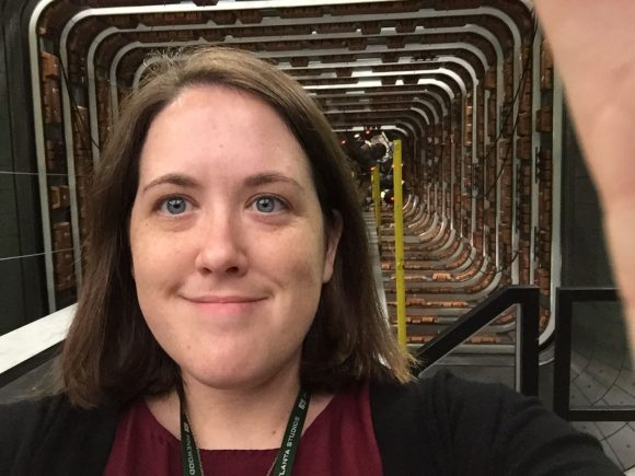
Gray and the quantum tunnel from Ant Man and the Wasp
Have you always been interested in pursuing a career in art?
I never actually thought about a career in art. It just kinda happened. If I were to lay blame on a childhood experience, I’d say it started with my high school art teacher Mary Hensler. She was the first teacher who encouraged me to pursue art as seriously as most of my peers were pursuing the S.A.T.’s. Almost my entire senior year was spent just experimenting and building a portfolio to submit to art schools. Yet, coming from a family of farmers, carpenters, and doctors, I knew making a livelihood as an “artist” or what I thought of at the time as a “painter” was very unlikely, if not impossible. So If I were to go to college for an art degree, I would benefit most from getting a degree that taught me how to be creative in a way I could make a reliable career. That’s how I ended up getting an undergraduate degree in Communications Design from Texas State University, with a focus on Graphic Design and Advertising. And as it turns out, I was great at it. I wasn’t a great painter, but I was clever, and great at developing logos.
How does your education from Chapman’s Production Design program translate into your present day work as a graphic artist? Do you have any standout professors or classes that greatly influenced your career?
In 2008 I was working at an advertising agency in Dallas, TX, and was completely miserable. I so quickly had lost all the love I had once had for my chosen career as a graphic designer. This was roughly the same time that the TV show Mad Men had come out, shining a light on the history of the industry I was working in. Watching the show hit WAY too close to home sometimes. Being a woman in a male dominated industry, I very much saw myself in a lot of the female characters on screen and experienced a lot of the same dismissal from older male colleagues. My talent as a designer was being ignored, and very much dismissed because of my gender and age.
In early 2009 I decided I needed a major life change and chose to quit my job and pursue a graduate degree, with the intent of using it to become a college professor someday. Problem was, I wasn’t sure what I should get a degree in. I was honestly traumatized from the advertising industry and needed to take a step back from being a graphic designer so nothing in the traditional sense of Art or Design interested me. Having always loved films and television my whole life, I took a chance and applied to Chapman University’s Production Design graduate program. I flew to Orange, California, and scheduled a time to see the school with the head of the production design department. That is when I first met Lawrence G. Paull. He absolutely changed my life that day. Lawrence “Larry” Paull, the production designer who had helped generate some of the most iconic elements in pop culture, from Blade Runner to Back to the Future, smiled his cheeky smile at me and simply said, “I think you’ll do well here.” Boy was he right. The two years I was in the Chapman Film Grad program were the two most life-changing years I’ve ever experienced.
I was already a good graphic designer and knew how to communicate ideas through graphics and iconography. I knew how to say something through my art. Larry Paull and Susanne Feller-Otto, our set design teacher, showed me how to apply that same knowledge to designing sets and ultimately designing films. It’s everything I learned in undergrad, expanded into a much larger world in graduate school. Larry and Suzanne taught me how to tell a story with my art.
How would you describe your personal style as an artist or designer? Who are your strongest creative influences?
Style in the film industry changes per the project the designer has to work on. So, style is always changing based on the script I’m working with. I’m always having to be adaptable to very different styles, which is a real challenge sometimes. Especially when you’re the only designer and need to make 50 ads for a bus that look like 50 different people designed them. But the common thread you can see in my work I think is comedy. I really like being funny for those specific people who are truly detail oriented. The people who are going to sit and watch a film frame by frame to truly see what is in the background. I’ve worked on a lot of comedies, so it’s been fun adding background jokes, often very well received and laughed at on set. Funny ads in a newspaper, or an alarmingly worded headline. Also being the graphic designer, we end up naming a lot of things in the background that are unscripted. So, I end up naming a lot of funny companies in the background or using names of my friends and family as little easter eggs for them.
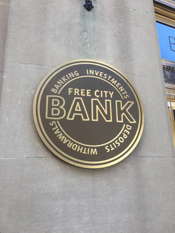
The Free City Bank Logo from Free Guy
The strongest creative influences are truly the production designers, art directors, set designers, props and costume people I work with on every project. We all work together and build off of one another’s art to truly make something as a group. I’m allowed a lot of creative control on what I’m working on, but I always want to make sure it is fitting within the theme and story we are all trying to tell.
Are there any past movies or shows with art designs that speak to your personal style?
While I’ve done a lot of comedies, I absolutely LOVE science fiction, and fantasy genre, which I’ve only had a limited chance to work on. Star Trek in all its forms being a graphic design favorite, and seeing the iconography started by Rick Sternbach and further developed by Michael Okuda.
Saul Bass is also an obvious favorite with the hugely iconic elements he developed in graphic design, which lead into design the full opening sequences for film like Vertigo, West Side Story, and The Seven Year Itch. Saul Bass as a graphic designer reinvented the way a film’s opening title gets an audience ready for what they are about to watch. Very straightforward textures and hard-line elements he used, still works great today, and I do end up using a lot in my own work.
More modern Films I’ve been immensely impressed with are Wes Anderson’s very iconic work. He utilizes graphics probably more than most modern directors currently.
Also, fellow Chapman Alums Matt and Mark Duffer’s, Stranger Things for Netflix has been very fun and engaging to watch from a design standpoint. It does what I most often have to do for work, which is design something new, that feels like something old. It is so grounded in its essence of nostalgia while feeling completely new at the same time.
What was it like working as a graphic designer with Marvel? Do you have any favorite moments from your experiences on Avengers: Endgame or Ant-Man & The Wasp?
So far, working on Ant-man & The Wasp for Marvel was the largest budgeted film, and the longest I’ve ever worked on a single project, and it was so much fun. I will forever be grateful to Jay Pelissier the supervising Art Director, who I worked with on Goliath for hooking me up with that job.
Going to work every day felt like I was going into play and have fun. And while one of the “lesser” famous Marvel characters, I didn’t realize at the time how much all the elements of the Marvel Universe were going to blend together. This was back in 2017 during Marvel’s Phase Three days, when they were just finishing Thor: Ragnarok and had just begun filming Endgame. While all the crew were working in the Marvel Universe, no one knew what the other movies were up to.
One of the first tasks I had was designing the logo for the company owned by the main character Scott Lang aka Ant-Man, “X-Con Security Consultants.” The very name was a play on words, and I had the job of pushing that joke further visually. The company needed to feel legit, and like the characters had invested money in branding. These ex-convicts were truly trying to turn their lives around with this business. But Luis and Scott, are still at heart, people who bend or disobey the rules.
The logo ultimately was going to be developed into a neon sign that was animated. So, I designed the sign for the “O” to resemble a combination padlock. Then I built a gif and animated the neon sign which essentially is a security padlock getting picked and popping open. Without the animation, it just alludes to security. When put in-motion, it’s a little less clear what their motivation is. Much like the characters themselves.
Several months later, the X-Con logo had been approved by director Peyton Reed, and I had already developed the vehicle graphics for Luis’ Brown 1972 Ford Ecoline van to include the logo on the side. It was then our coordinator started getting requests from the crew working on Endgame to see what I was up to with the van. Having no idea what their storyline was in the Marvel Universe, I was instructed to hand over my graphics to them. I did so not thinking anything of it at the time. Then I was pleasantly surprised when *spoiler alert* the ugly brown van with my little “X-Con” logo graphic on the side played a HUGE role in saving everyone in the Marvel universe in Avengers Endgame. Thus, my uncredited credit on IMDB. My happy little achievement in pop-culture.
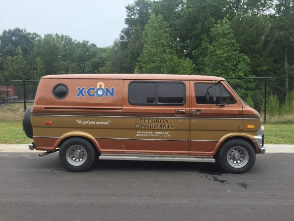
The X-Con Van from Ant-Man and the Wasp
How do the art departments compare for animated vs live action programs? Unscripted vs scripted content?
One of the opportunities going back to grad school at Chapman gave me was the opportunity to Intern at Pixar Animation Studios in the summer of 2010. I was hired by Pixar to be the graphics intern on Cars 2 because of my experience in designing logos and branding. Since Cars is all based around race cars, and industry involving tons of branding, it was a good fit. That summer I learned to enjoy working as a graphic designer again. And while I was just an intern, I was treated as an equal more so than I had ever been by my fellow designers. I even ran into Craig Foster, the graphic designer I worked with at Pixar, years later at an ADG Awards ceremony and was so proud that he remembered me.
Working as a designer in Animation, and as a designer in Scripted Live Action is essentially the same, but in Animation you get a lot more time because the entire world is completely built from scratch. There also tends to be a lot more designers to work with as well. Sadly, with animation your only interaction with what you create happens on a screen.
Live action scripted, you’re working with a lot less time, and often are trying to manipulate real world elements to fit into the world you’re attempting to build. And almost all of the time, I’m the only graphic designer as well. In that way, I don’t get to meet a lot of my fellow graphic designers in the film industry.
I loved my brief time at Pixar but working solely in Animation was too slow paced for me. I wanted to be on the ground, working in film, seeing the world I was helping to design built before me in real life. Even if there were a lot of green screens around. There is something more satisfying about seeing what is born on my computer with the flicks of my fingers, printed and built into something I can touch.
As for the bit of my career in Reality TV, when I graduated from Chapman in 2011, the film industry was still fresh off the Writer’s Strike. Streaming was something only thought of as being on Youtube, and Netflix was still peddling DVDs through the mail. Unscripted, non-union Reality TV was booming big time, so that is where I went, and how I truly started my career in Hollywood. I was hired under a number of different titles in the art department, but always ended up doing all the graphics for whatever show I was on. Even if I was the art director, I still did all the graphic design.
And while non-union reality work was brutal, I can say I’ve slept in a cell on Alcatraz Island, bleached pirate flags in my backyard, set designed a mythical castle built in Europe, and designed an entire font to look like ancient runes for a mythical world. It was the truest and toughest education on how to literally do everything in the art department you could ask for.
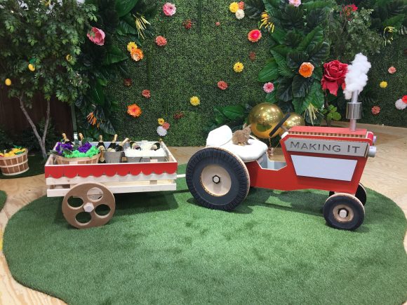
Tractor from Making It
You’ve had the opportunity to work on the graphics for a large amount of unscripted, competition shows, including Holey Moley, Making It, and Lego Masters. Would you ever go on a reality show, and if so, which one?
I consider it a blessing I started my career in Reality TV, even though when I started, there was an industry stigma against people who work excessively in Reality TV. I’m not even really sure why, other than it was just a lot harder work for a lot lower pay. Just because the filmed content is not scripted, doesn’t mean the creative and hardworking designers and art directors who work in that genre are any less talented than our brethren who work in scripted. The stigma has diminished slightly as more and more content is being created, and more talented people are needed to fill the demand for crew.
In fact, the people I started my career off on a show called The Great Escape are still calling me to work with them. Stuart Frossell, the production designer I worked on The Great Escape, not only elevated me in the industry through the years, hiring me for many shows, but also my fellow Art Production Assistant Justyna Kornacka, who is now an excellent Art Director herself.
Because of my multi-faceted education, I get a lot of work photoshopping for various jobs, which led me to getting the graphic design job for Holy Moly season 2, 3, and 4. Someone had to generate the prestigious animal golfer paintings in the background. So, in a way I guess I did end up a professional painter after all.
The two genres of scripted film and unscripted reality tv function very differently in how content is created by the art department. For reality, everything has to be ready and happen before you even start filming, so there is a lot more put into preproduction, and planning so everything is set before the cameras even start rolling.
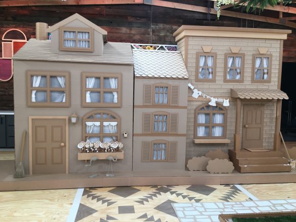
Cardboard town from Making It
For challenge-based shows, like Making It, I was hired to be the Assistant Art Director for the Challenge Department, and it’s one of the few times I didn’t do any graphics! Justyna Kornacka the Art Director and I teamed up for our first show back after the Pandemic shut down in 2020. We got to develop the pallets and elements the contestants or “Makers” developed their crafts upon. We had to design the canvas, while the Makers provided the paint. We had to make sure that all the pallets were mobile and could wheel in and out of the barn doors. Not always an easy task when it needs to look like a real front porch of a house. But we got the opportunity to play with the elements we designed for the backgrounds, and I was quite proud of the Cardboard Village Justyna concepted and I designed for the sharing challenge in Season 3 Episode 2. I was happy to see our season of the show was recently nominated for an Emmy for Outstanding Reality or Competition Program.
And it’s funny you ask if I would go on a reality show, because I had people telling me I should be on Making it. Funny I ended up working on it. And honestly, there is no way I’d ever go on a reality show, other than The Price Is Right. My life is better lived behind the camera, designing the world for you to point the camera at.
And while graphic design is still getting me work and definitely pays the bills, my goal in this industry is to be a production designer. I finally had the opportunity to do so with fellow Chapman Alum Director Caylee So, last year in 2021. Caylee hired me as production designer for the film called The Harvest, which we filmed here in LA. Caylee and I were at Chapman at the same time, but never got the opportunity to work together on a film when we were students. We remained friends over the years, and that has been one of the biggest impacts on my life Chapman provided is the extremely strong and valuable friendships I’ve made with my peers. They are my family. When this directing opportunity came to Caylee, she called me and asked if I was available to take over as Production Designer. I poured myself in to the film in a way I hadn’t done since Chapman, to really do everything possible to make a feature film, and develop a world for characters to live in that felt authentic. Caylee was a dream to work with, and it really was almost a reunion of so many Chapman Alumni from the 2009-2012 days. Frank Martinez as Editor, Sharon Waich as First AD, Caylee So as Director, and myself as Production Designer. All of us met at Chapman, and we reunited to make a film. A dream coming true for all of us.

