Telling Chapman’s Story: Designing a new Homepage for ChapmanU
January 15, 2014
I am fairly certain without knowing, I have been thinking about this new homepage design since I started working for Chapman five years ago. If there has been one thing I have learned over and over again since I began working here, it is that our students, alumni, faculty and staff
really
(
really!
) love this school. It isn’t just a place to earn a degree – it’s a place where
ideas start
, where
friendships are made
, where
mentors are found
. It’s a place where changes begin. And the family that makes up those changes, well they are fiercely loyal. As my colleague
Ross Loehner
put it, “
at Chapman there’s an energy that runs through everything and everyone
.” And that energy- it is pretty darn infectious. Working in this community I feel that energy everyday, I wake up every morning excited to come to work because, as the university’s web designer, I see and hear the stories that make up the Chapman family. I hear about students
making films
and
winning awards
,
companies starting
,
careers blossoming
, and
non-profit’s flourishing
. And that is what inspired this newest iteration of Chapman’s website: the stories, people and work that make up Chapman.
An Iterative Approach
A Simplified Navigation and New Typography
You might hear the
WIM team
wax poetic about using an
iterative design
approach to Chapman’s website, this is because we really believe in enhancing the user experience through studied and frequent updates. Recently
David May
reminded us
how far Chapman’s website has come
and why it is important it continue evolving. Over this last month and in the coming months you will see some additional progressive enhancements to Chapman’s website. The first set of changes, you may have noticed last month, were subtle changes we made to the typography and global navigation based on community feedback and user testing. The fonts now mirror Chapman’s on campus typography, a modern geometric sans-serif reflective of Southern California’s architectural heritage. The global navigation menus have been simplified, the roles based navigation, search and login have been updated for ease of use and recognition.
A simplified re-organized navigation with increased legibility.
New and refined functionality.
The second set of changes that will role out over the coming months are focused on bringing Chapman’s stories to forefront and include our newest iteration of Chapman’s homepage.
Incorporating User Feedback
Over the course of the last two years WIM has been gathering data and
feedback
. We have performed user testing and surveyed our community both formally and informally (I’m sure more than one of you have seen us
wandering around campus tablet in hand
). Through all of this data gathering we determined areas of the website that were consistently difficult to use, misunderstood and frustrating, but we also gathered feedback on what our community felt was missing. A few sentiments routinely came to the forefront, and those concerns formed the basis of our design decisions.
Story Based Marketing
Over and over our community- current students, alumni, faculty expressed a desire to see content on the homepage change more frequently and feature stories, events and happenings relevant to the community.
Community responses to the current homepage:
“Lack of info on current ongoings at school.”
“More Alumni representation!”
“The homepage makes me feel like Chapman is artsy or creative and our community is talented but we lack reference to ‘hard’ disciplines.”
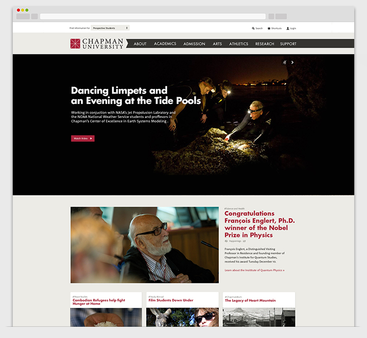
With this newest homepage we have a design that will allow us to showcase content more engaging, representative and relevant to the life of the university. This homepage with feature content that comes from the Chapman family. Your stories curated to showcase an authentic view of Chapman’s unique attributes. This new format will also allow us more flexibility, enabling the content to change with more frequency.
We are also very excited in WIM that this new homepage, coded in house thanks to
Ben Cole
and Mandy Thomas, will make good use of a lot of cutting-edge html5 video backgrounds and animations. The new homepage will continue to be responsive to ensure a good user experience across browsers and devices. (Though we encourage you to view our new homepage using a modern browser to see all the fancy shmancy stuff!).
Inside.Chapman Integration and Community Submissions
The other sentiment expressed by our community was the desire to find a way their department/program/event/issue could be represented on the homepage more often. This is a challenging request, though understandable, because the homepage of the university must meet specific user needs and achieve institutional marketing goals. What we have come to realize is that our marketing needs and those of our community align and support one another.
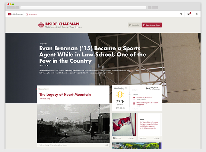
Inside.Chapman
, our newest web product aggregates content from our community, it’s function is to (through some
fancy algorithms
) curate the most relevant and popular content from our blogs, social media accounts and campus events. Inside.Chapman is what is happening at Chapman University now. Our newest homepage will integrate heavily with Inside.Chapman, featuring feeds and the best stories, news, and photographs from Inside.Chapman.
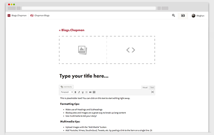
The part of Inside.Chapman and the new homepage we are most excited about is the ability for any member of our community to contribute content by posting blog stories through our newest
Blogs.Chapman
functionality. Any member of the Chapman community with a Chapman ID will be able to write and submit stories to our blog editors. By contributing quality content every member of our community has the opportunity to see their story, event or idea promoted to Chapman’s homepage.

Being the Sr. Web Designer it falls to me to explain all the upcoming changes, what they mean and how we arrived at the solutions but I want to stress how much of a collaborative effort these change are- this design and new functionality are the brainchild of the Web and Interactive Marketing team, Strategic Marketing and Communications and most importantly, the input of the Chapman community. And because
iterative
is the word around WIM we expect you, our community, to continue giving us feedback into how we can improve.


