Chapman Online: Social Media Do’s and Don’ts
February 17, 2015

Are you in charge of managing social media with an organization? What about using social media to increase enrollment or donations? Chapman University has strategically set up CU outlets for your school or organization to succeed online. Maybe you are just getting started or you have been at it for a while. Whatever the case, SMC is always here to help!
With information so readily available, it is up to the schools and departments to manage online content wisely. Using social media as a tool to reach your audience is a great strategy, but don’t fall into these ‘social media traps’ and pay attention to these helpful tips to help reach your goals!
The “F” Formation
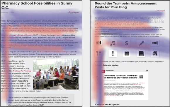
People read books and the web differently.
Research done by the
Nielsen Norman Group
shows that the most common reading pattern is in a large “F.” Users will read a page for the most important information at the top and will scan quickly through the bottom. This means text should be concise, images clear, and main points given at the beginning of your content. Try formatting your blog to fit the “F” shape!
Sharing Technical and Academic Information
We know sometimes academic writings can get technical and confusing.
Writing in an engaging story form or with a “How To” personal attitude can help make your content digestible online.
Ross Loehner
, Web Content Manager for Chapman University finds this intersection in his article ”
Content Marketing Explained
.” He states that when you write in a story form or in a way that shares advice:
” …you are building trust and credibility [with the reader] though valuable content, which then leads to action.” This “costs 62% less than traditional marketing and generate about 3 times as many leads.” Loehner states.
Don’t know what platforms to start on? Have you already started on social media, but want more exposure? Read Loehner’s
article
to find out which Chapman platforms you should use.
Write Less, Get more
USE LINKS.
If you can link your social media to a page that has more in depth information, do it! Don’t make more work for yourself by repeating the same information. And remember,
as much as possible link to Chapman pages.
Linking to Chapman pages keeps the user on
our
site, meaning more exposure to
our
schools.
Using Internet Images: Licensing
Sometimes we can be prone to “Googling” an image and using that in our posts, but
did you know you could get sued?
Protecting your school may be just as simple as using a filter. If you use Google to find an image on the internet, make sure you filter your search.
Under Image Search go to >Search Tools>Labeled for Reuse
. This can potentially save us a big headache in the future. An example of websites you can try to find free, public, reusable images is
Creative Commons
. Just be sure to ALWAYS check the licensing and give credit where credit is due. Keep in mind to also refrain from using images from another person’s social media/website.

Image Quality, Less Important?
High Definition pictures are important and help to engage your readers. If it is not high def? No worries! Just make sure your pictures help ”
tell the story.”
Dawn Bonker
of Chapman University’s ”
Happenings,
“ writes how a simple picture can have awesome results. With this author’s work viewed more than 5,000 times, at a “Gold Social Shares” level, Bonker shares in
her article
the importance of photos:
“They help tell the story, add visual interest and catch readers’ attention. So we wanted to give a shout out to the folks in Student Life who sent us a nice one recently. They knew the two ingredients they needed in the shot — Chapman people and the special place. They got both in this photo.” says Bonker.
The perfect image combination? High quality, story telling Images.
Headshots as Feature Images: A Big NO
Using headshots as feature images returns with very low read numbers and are not visually appealing (
4.Blog Post Elements
). Many of our social media platforms are linked together to gain the most exposure. If not paying attention, images or content can be distorted, cropped or pixilated when transferred over.
Facebook: Social.Chapman:

A better place for head shots is within the body of the text itself. To optimize, feel free to change that feature image with another. Some ways to change or add your own/different image can be seen on our SMC resource page.
Images In the Body of the Text
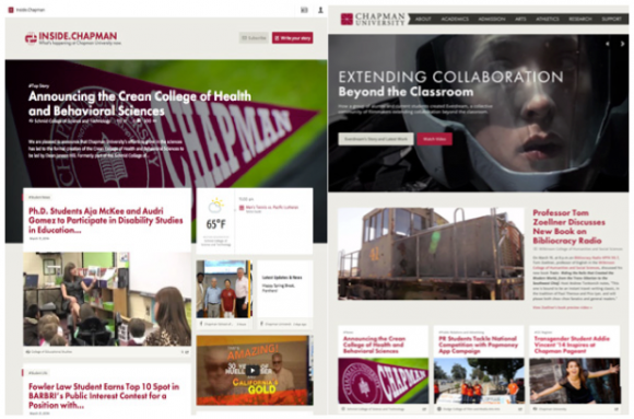
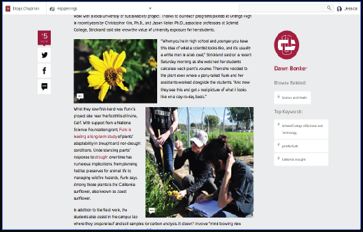
Placement of images matter. Images should also be kept clean and are recognizable at first glance, helping readers stay engaged till the very end. When organizing your photos, be sure to remember the “F” shape readers scan with. Dawn Bonker’s
article on a botany lesson
with associate professor Dr. Funk is a
great example
of numerous images in an article. Have one large, high quality image? Check out how she composed it in
her article on Amanda Seales
for an example.
Text in your Images
We greatly discourage text to be in images unless formatted to fit the regulations set by the
Americans with Disabilities Act.
To see if your image with text fits the required formatting, see more under the SMC Web resource page in our
Image Guidelines Section
. To prevent any mishaps, using your own image with no important featured text is your best bet to stay ADA compliant on your social media!
Right Content, Wrong Platform
Twitter allows you 140 characters. Facebook lets you tag your “friends.” A website page can offer a section for more detailed information.
Valerie McNutt,
Web Coordinator for Chapman University illustrates it best in her article ”
Right Content Wrong Foot
.” There she states:
“Great content on the right platform will make a splash and get a boost through sharing and commenting. Great content on the wrong platform will be just as uncomfortable and ill suited as putting shoes on the wrong feet.” says McNutt.
Find out which “shoe”
fits your content
the best in
her article
. You can also use the
announcement posts
on the blog network to help give attention to your smaller post with specific icons. Use it well and your school can hit the ground running every time!
Need more tips? Check out our Writing Style Guide for more help on writing and SMC’s Social Media Resource Section for more information.


