
Panther Analytics Is Moving To Power BI
June 12, 2025
For many years, Panther Analytics reports have been delivered using two reporting tools: Pyramid for visualizations like charts and summarized tables and SSRS (SQL Server Reporting Services) for large, paginated spreadsheets of data. In a few weeks, Microsoft’s Power BI will be replacing Pyramid. This article will explain how this change will impact your experience with Panther Analytics.
Report Delivery
The Panther Analytics landing page will remain the main portal for Panther Analytics reports. Clicking links on the Panther Analytics page will bring you directly to the report you’re looking for in the Power BI Service or SSRS. Reports in either location should have a “Back to Panther Analytics” link you can click to return to the landing page. (If they don’t, they will soon!)
Logging In
Power BI reports work with Chapman’s Single Sign-On (SSO), which means users will rarely be asked to sign in, even though the report is still secured to the user. The VPN is also not required for off-campus access.
However, SSRS reports will still require a separate sign-in using Chapman credentials and the VPN if off-campus. Where possible, IS&T is working to convert these reports to a type that works with SSO and without VPN.
Navigating within a Report
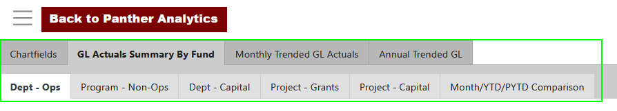
Pyramid reports were sometimes divided into multiple pages, which could be accessed through different tabs along the top of the report. Sometimes those tabs were grouped into two levels, like this:
Power BI reports are organized differently. The content of a Power BI report is organized using the left-hand navigation bar instead:
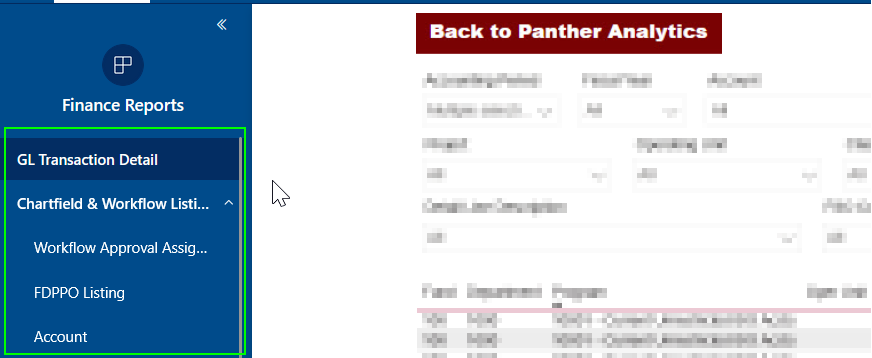
Unlike Pyramid, the Power BI left-hand navigation bar may also display links to other reports you can access. If you ever get lost, remember to return to the Panther Analytics landing page, which is the clearest representation of how Panther Analytics reports are organized and is the best way to determine which report you’re looking at or the name of a report you need access to.
Exporting Data
In Pyramid, you could copy data into an Excel spreadsheet through the Print & Export menu. If multiple visualizations were shown on the page, they would be captured in different sheets in the Excel spreadsheet.
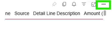
In Power BI, each visualization (where it is enabled) has a separate menu for exporting. Hover over the visualization with the mouse pointer; you might see a menu at the top. Click the dots at the far right, and if exporting is available, you’ll see an option to Export Data. Several export methods may be shown; read the explanations and choose the one that fits your needs.
 Drill-through
Some Pyramid reports allowed you to see the details behind the numbers. For example, in a table of Expense amounts, you might have been able to drill through to the Journal Entry lines that contributed to an amount. Or, in a table showing the counts of students in different majors, you could drill through the names and emails of the students in the major. Pyramid called this a Cell Action.
Power BI also supports drill-throughs if the report is meant to and you belong to a security group where it is permitted. The process is similar: right-click on the number or category you would like details for and choose “Drill through.” Several drill-throughs may be available, displaying different data.
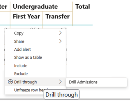
After reviewing the details, a back button will return you to the main report. It’s usually at the top left.

Last Updated Timestamp
Panther Analytics reports are not real-time. They are usually updated every night from the source system–mainly one of the three pillars of PeopleSoft: Finance, HCM, or Campus Solutions. This update has many moving parts, and the updated reports are usually available before 8 am each morning.
In Pyramid, we tried to inform you about the timeliness of the data by including on every report the date and time that the process finished. In Power BI, the timestamp will now reflect when the data copy started, which will more clearly tell you what data was included in the nightly update. The timestamp is usually found at the top right of the reports.
Occasionally, the overnight process takes longer than usual. Rarely, it may not finish, or the Power BI connection with the finished data will fail. In these cases, the timestamp will reflect the copy time for the data you are looking at—i.e., the last successful run. If the timestamp is more than twenty-four hours ago, you may want to return to the report later.
SSRS
Earlier in this article, we mentioned SSRS (SQL Server Reporting Services) reports. This report format is still the best for displaying large spreadsheets of data. These may continue to appear the same. However, SSRS reports can be integrated into the Power BI service as Paginated Reports. These function the same way as SSRS reports, but because they are delivered through the Power BI service, they may look slightly different and do not require a separate login or the VPN.
Feedback
If you have feedback, questions, or concerns about the timeline or conversion, please contact us at pantheranalytics@chapman.edu.