Designing with “Less is More”
August 15, 2013
The principle “Less is More” is a guideline which I try to ascribe to when designing for Chapman University marketing. Let’s start at the beginning.
THE IDEA
You, the client, have an exciting, impassioned idea for something you want realized graphically. I expect you to know your subject matter well enough to articulate your message verbally. I know nothing of your expertise, so I rely on you to know what you are talking about. If you have any other content that would help convey that message (photography, logos, illustrations, statistics, physical assets like books, artifacts, art, etc.), it should be presented right at the start of the project. Everything at the beginning builds the foundation on which the idea stands.
THE CONTENT
Answer the basic, most pertinent questions: who, what, when, where, why, and how. If you are speaking to an audience outside of Chapman University, use common vernacular (layman’s terms) to help them find you. Use terminology that the average high school graduate would understand, since they are the ones making the decision to pursue Chapman University. Some of the best, lasting ad campaigns keep it short, simple, and memorable. Which sounds better:
The purpose of this communication is to ascertain whether you are sufficiently provisioned with the lactic secretions of bovines.
OR
Got Milk?
A focused client message will fuel good design and direction. In my opinion, write no more than one third of the page. Even then, cutting down the copy to its most concise message, “the less is more theory.” Know what you’re talking about, and know your audience. You have three seconds to get their attention. You don’t need everyone to hear you, but you want your target audience to be “called to action” and motivated to look for more (i.e. QR codes, phone numbers, webpages, social media, online video, apps, etc.). Your text is the heart of the piece. It is the first thing that defines the space. I can’t start designing without it.
THE VISUAL
If the content text follows my “one third” rule, we afford the design negative space, or “white space” allowing page elements air to breathe. Don’t choke your message. If you want to give your project life, it needs to breathe. Looking at a dense block of text is typically displeasing to the eye and a quick way to deter your audience. Negative space helps frame your message, making the content less daunting, and providing a stage for the imagery that you are presenting.

LEFT: BAD example from McDonalds. Do not over think a Cheeseburger. This is too text heavy for a Cheeseburger. This ad does not warrant a dissertation. It is 1/3 image and 2/3 text. The ratio of text to image should be inverted.RIGHT: GREAT example from McDonalds. There is genius in its conceptual simplicity.
COW + TRAMPOLINE = MILKSHAKE. This ad is thought provoking and witty. I feel emotionally invested and I can’t help, but smile.
Great imagery is a must 99 percent of the time. If “A picture is worth a thousand words,” you already have a thousand words that took only two seconds to absorb. Let the image help summarize your story.
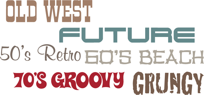
If there is no image, I try to create a style that complements the message: Old West, Futuristic, Loud, Solemn, etc. Whatever is appropriate for your project.

If your message has a tone, feel, or comparable brand/example that illustrates what you see in your mind (i.e. Gap, Metallica, Apple Computers, BMW), that will help direct me so much better than, “I don’t know, do something creative.”
Everyone has likes and dislikes, so your opinion or visual preference, especially on your expertise, does matter.
COOKS IN THE KITCHEN
I say this too often, “There are too many cooks in the kitchen.” Own up to the project and I will own up to my design. Art and design are aesthetically subjective, so asking everyone’s opinion will not lead to a good compromise, but rather a list of growing doubts. Please bring all necessary opinions to the project right at the beginning. Any input on the project should come first, so that any unnecessary design directions will not be pursued, and time will not be wasted. Less cooks means more focus.
This is your project, so speak up. In the end, I want you to feel that the end product fulfills its communicative goals and you can be proud of what is being presented.
Creativity is allowing yourself to make mistakes.
Art is knowing which ones to keep.
Scott Adams, ‘The Dilbert Principle’
US cartoonist (1957 – )
