Chapman University – New Look for our Homepage
September 29, 2011
Hello Readers,
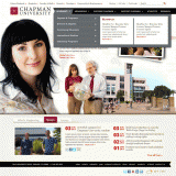
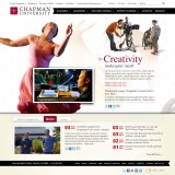
As you may know, Chapman is getting a new website in the Spring of 2012. We are excited to announce Chapman’s new homepage which will launch this fall, and would like to post some images of the new design for feedback.
Before you take a peek at the new site, there are just a few things you need to know. What you are about to see is not a working site. It is simply a few pictures that have been prepared by our design group. The functionality and ‘feel’ of the new site are difficult to illustrate in this format. Naturally, if you have any questions or comments, please feel free to utilize our feedback form.
Top Section: Global Navigation
When the rest of the new site arrives (spring 2012), this section will remain throughout as ‘global navigation.’ This fall, we will launch just the new homepage which will link back to the existing site.
Middle Section of Homepage:
- The middle of the homepage would slide left and right and provide lots of real estate for interesting stories, pictures, videos, etc.
- The center area will be built in three layers, so there will be an element of depth. Unfortunately that cannot be illustrated until the site is actually built.
- “Stories” and associated pictures / video (the ones inside frames) will be easily changeable.
- “Stages” are planned to change as well, but not as frequently as the stories. Stages are created by the photoshopped images that dress the stories.
- 25 Live will power the events area.
- Both “Cascade Server” and “WordPress” will be able to power the news area.
Footer:
This area will also be a ‘global navigation’ area. Here, you will easily find links to Jobs, the Privacy Policy, etc.
Design:


