The User & The Viewer: 4 Design Lessons From LACMA's Gallery Floor
August 4, 2015
“I would just as soon that the process evaporates and you have to deal with the experience of the work.” - Chris Burden
Recently, I was walking the gallery floors of the newer Broad Contemporary Art Museum at the Los Angeles County Museum of Art (LACMA). During every visit, there is always some piece that seems to stand out and stick with me. But as I walked around I was also struck by how little a divide there is between creative mediums like art and interface design. I’ve come across a lot of opinions about the differences between art and design, but in practice all creative mediums are ways of crafting experiences for people. Behind the interactions we create with objects and ideas, whether in a gallery or on a screen, is a human being.
Noticing how the art moved viewers through the gallery that day, communicating an artist’s intention, was not so different from observing the way users move through an app or a website. Design, like art, is an examination of the interaction between ideas and human experience. So this article, part excuse to philosophize about art (critical theory papers I miss you!), part examination of this idea, will expand on some of the commonalities I observed between contemporary art and design.
1. Tone is the heart of engagement (AKA Art direction is where it’s at).

Metropolis II (2011) kinetic art project by Chris Burden
For awhile it’s easy to
get lost in Burden’s mechanized playground
. It’s playful and encompassing, easily engaging viewers in a cacophony of sound and movement. The tone supports the intentions of the artwork.
To really engage users, the tone of the design and interactions must be the fine point at the end of the content.
Engaging a website user isn’t about creating a web page filled with animations and background video. To really engage users, the tone of the design and interactions must be the fine point at the end of the content. The tone strengthens the messaging, underpinning what can’t be communicated through words alone.

Appropriately toned for the content, the interactions in this BU article effectively support the content without calling attention to themselves.
Boston University’s editorial content
has long been an excellent example of good art direction, which is essentially what I am talking about when I say tone here. They have done an excellent job matching the tone of the design, with the message of the content – specifically in their considered use of interactions. In their
article on ant evolution
, the addition of exploring a 3-D model of ant brain is an appropriate and effective interaction – engaging without being obtrusive.
For the tone, content, and design to meld successfully, there really needs to be solid art direction (this oldie but a goodie
A List Apart article
by
@danielmall
sums it up nicely).
2. Provide many paths, but be specific.
On the gallery floor of LACMA every visitor has a purpose. Their purposes can be different but they are there, seeking information with a unique set of expectations and even challenges to experiencing the gallery.
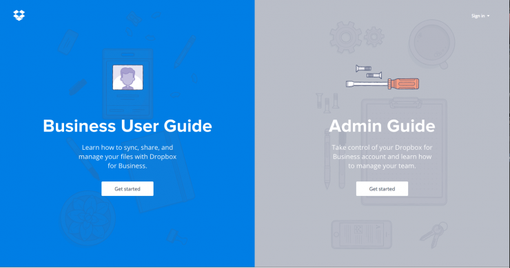
Dropbox’s user guide does a good job of providing a variety of paths for the user to access key information.
Specificity in tone, design and content is what communicates intention, just as it does in a work of art.
As designers, we have to create experiences that lead users towards action and are accessible across devices and abilities but to be effective we can’t shy away from specificity. Because specificity in tone, design and content is what communicates intention, just as it does in an artwork.
It’s not uncommon as a designer to encounter a client afraid of being specific, concerned with casting the net too narrowly. But generic images, interactions, design and content – while intended to be inclusive easily become un-memorable, leaving little substance for a user to connect with or react to. Design to speak your intentions clearly and specifically, providing many paths for the user to experience that intention.
As a university with a large clientele and diverse messaging, this is an area that is a challenge for us. To achieve a specificity and clarity of Chapman’s message we are focusing on designs that represent the core qualities we identify with a Chapman education: namely an open, innovative space filled with resources and cross disciplinary hands-on work. One solution we are experimenting with is the repetition of key CTAs connected to relevant content throughout the interface, rather than exhaustive navigation.
3. Resolvable tensions move users towards action.
“To design a Spatial Interface, you need to think inside and outside the bounds of the screen.” - Pasquale D’Silva

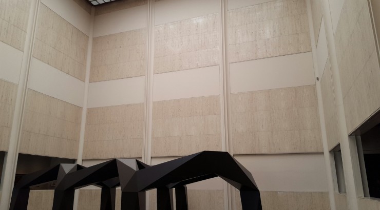
Band (2006) by Richard Serra
As I moved around a bend in Serra’s sculpture, laying on the floor at my feet were more than a dozen dead crows cast in bronze comprising Kiki Smith’s “
Jersey Crows
” installation. I had skipped right past them before, engaged by other artworks, but it was the spatial interplay that moved my eyes, and then my feet to see it.
Animation alone doesn’t increase interaction, to engage a user and move them toward an action, there must be a tension that needs resolving.
All users scroll
, the data supports this but what compels a user to engage? In my example from the gallery there were two things at play: intrigue and spatial relationships. An intriguing video, a narrative layout or content that answers the right question at the right place. The placement of CTAs, the timing of an animation, the contrasts in color and content are all aspects of a design that benefit from considering spatial relationships.
Chapman’s Digital Signage
One of the projects we worked on this last year was the implementation of an in-house
digital signage
product. The university needed an inexpensive way to display consistent messaging and emergency information. Clients across campus were all using different products on hardware of varying ages.
Our solution was a
ractive
based web application that worked with our current cms, Cascade Server, running as a chrome kiosk app. An extensive audit of the content currently displaying on the screens revealed core uses for our digital signage and led to a series of flexible templates for the first release.


During the design of the templates, we considered how the product should adapt to the screen size, the viewing distance, how a user could interact with the screens when touch was an available input and especially how we could mitigate frustration when the screen did not have touch capabilities. Key components to achieving these goals were ensuring solid responsiveness tied to ratio and including wayfinding elements viewable from various distances.

Once deployed we were able to quickly see ways to improve the product, as is always the case, but this first iteration achieved our primary goals and created a consistent experience. It remains to be determined how much action is associated with the change in signage on campus, data and time will tell. However, like the space inside and outside of Serra’s sculpture,
designs that carefully consider spatial relationships create resolvable tensions that move users towards action
.
4. Let the user see where they are going and where they have been.
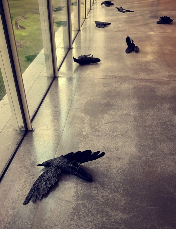
Jersey Crows (1995) by Kiki Smith
Smith’s crows are effective in their messaging. The medium’s literal heaviness is significant, yet the piece is fully accessible. It doesn’t overwhelm or force the viewer into a hierarchy, it suggests and leads towards action.
Interfaces that require a user to input data need to communicate to the user where they are going and where they have been. If a user is trepidatious about what a submit button means, or if whether they can correct mistakes they become frustrated. A well-designed website will leave a user with a comfortable understanding of their place in the site or process without the need for an overwhelming amount of detail.
Basically I should have titled this article…
“Why kick ass art direction and UX is always present in successful creative projects: Regardless of medium.”
Kiki Smith’s “Jersey Crows” were my favorite piece from this last visit because of the way they interacted with the gallery space. They were aesthetically beautiful, tactile and full of tension. They stood as a reminder that underpinning all designed experiences are people: the viewers and the users who have showed up to your idea, ready with their own purpose, to experience what you created. There are never any clear answers, no article can tell you exactly what you are doing right or wrong but that is what is great about doing creative work. Your job is to ask questions and search for answers. Sometimes even between the walls of a gallery.
Originally published on Medium.